


The Trend Trap: Part 1
Some design trends are everywhere right now. But should they be?

I recently published a LinkedIn post about design trends and their blinding effect on designers.
The post generated over 37,000 impressions and reached more than 21,000 members. Many admitted they’ve been quietly frustrated, and industry veterans called out how these trends are doing more harm than good.
Hence, this edition of Design in Action breaks down the most overused trends in design today and why they shouldn’t be everywhere.
#1 The Gradient Comeback

The Web 2.0 Era (2000s) brought gradients everywhere. Apple's glossy buttons, Microsoft logos, and early app icons all tried to mimic real-world textures and lighting. Then the minimal startup era hit in 2013. Flat design took over. Designers stripped away drop shadows, bevels, and gradients for clean, minimal looks.
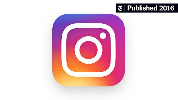
Gradients returned in 2015/16, but this time, they were refined, abstract, and brand-led. Instagram's 2016 rebrand was the turning point. Their vibrant pink-purple-orange gradient logo was bold, modern, and instantly recognizable. Spotify and Apple followed with smooth gradients in playlist covers, campaigns, event invites, watch faces, and iOS wallpapers.
Brands everywhere started adding gradients to illustrations and UI elements for subtle vibrancy.
Studies validated this trend, showing that gradients communicate energy, emotion, and represent modern pop culture.
Why are we following the trend?
Gradients feel fresh and digital-first, signaling innovation.
Tools like Figma, Webflow, Canva, and AI generators made it easier to experiment and deploy gradients.
Gradients pop on feeds. They make content more eye-catching and thumb-stopping.
They're often used as a shortcut to make designs feel lively without committing to bold illustration or complex art direction.
Why should this trend not be everywhere?
I see many designers slap on gradients without a clear reason. They are everywhere, often used as default backgrounds to make things look good, even when they don’t align with the brand or connect with the user. I’ve seen gradients that feel overly scientific or mechanical applied to skincare, crypto, and coffee brands, all using the same pink to orange or green to blue transitions.
I recently came across a poorly printed gradient on packaging and it was a clear reminder that printing a smooth gradient takes technical finesse. This is what happens when trends are followed without deep knowledge.
Gradients can work beautifully when they reflect the brand’s personality. Use them with intention, not imitation. Let them serve your story, not just the trend.
#2 The &Walsh Style
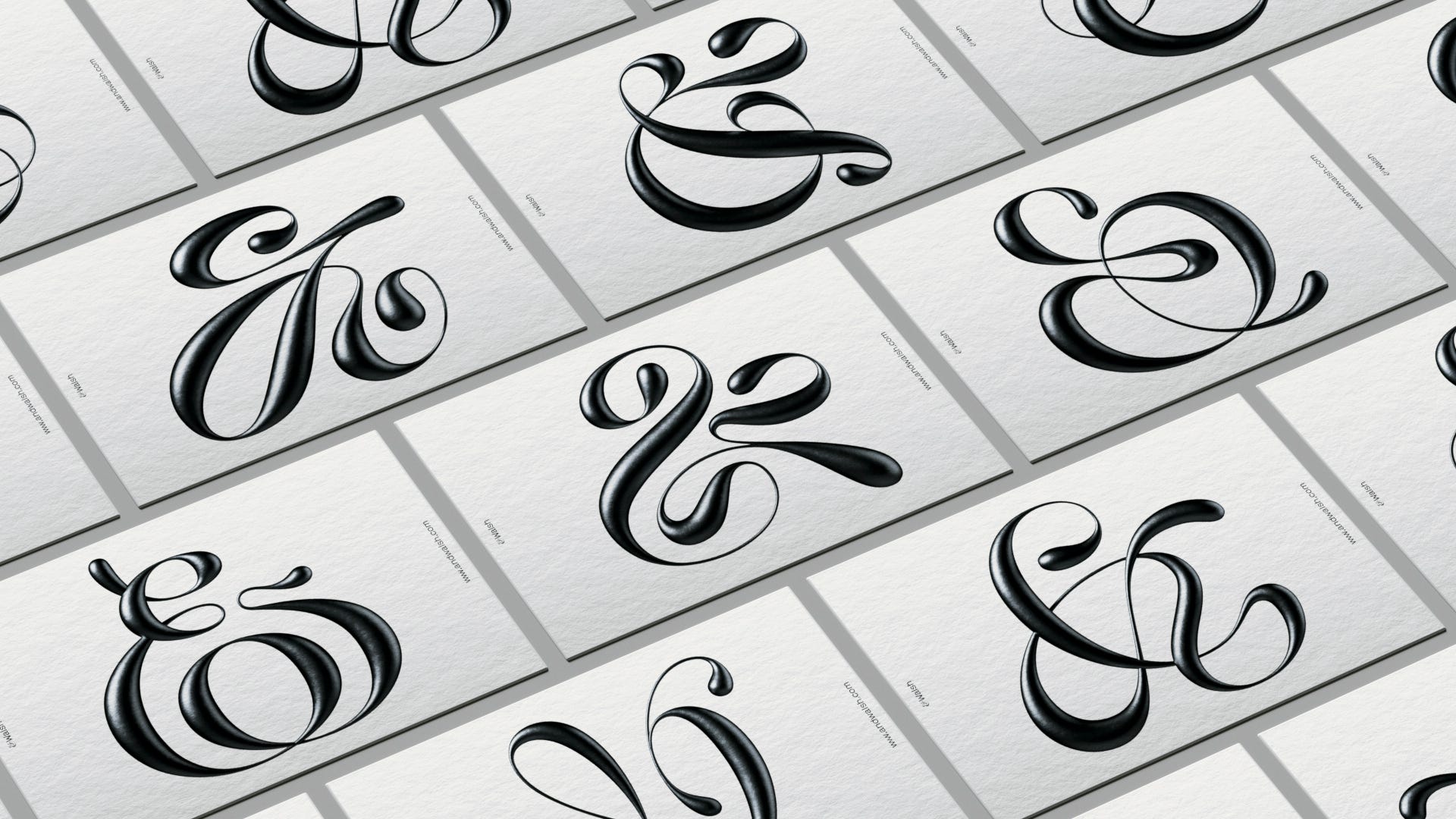
This style is a striking blend of calligraphic rhythm and digital precision. Characterized by glossy, high-shine finishes, liquid-like gradients, and bold swashes, these symbols often become standalone design objects.
This aesthetic draws from the worlds of calligraphy, sign painting, and luxury editorial design, elevated further by modern tools like Illustrator and 3D rendering software.
Jessica Walsh was one of the first celebrity designers to popularize this approach. For her, these expressive letterforms extended her identity and shifted how typography is most commonly treated.
Why are we following the trend?
Maximalism is making a comeback, like how gradients came back on 2016.
Designers are embracing visual richness, ornamentation, and adding layers to their work again.This kind of work is often positioned as something that showcases ‘skill’, a flex of control, finesse, and digital craftsmanship.
Many designers reference Jessica’s work directly, making it one of the most widely replicated styles in contemporary type design. Its popularity is as much about visual impact as it is about cultural influence.
Why should this trend not be everywhere?
The style has become so popular that many designs now look indistinguishable from one another. Without a clear concept or connection to the brand, these letterforms risk becoming aesthetic filler. Also, this style, when used purely for decoration, can easily overshadow the message or feel disconnected from the brand’s voice. Their readability also drops significantly at smaller sizes, making them less functional in digital or UX contexts.
It’s important to remember that just because a celebrity designer like Jessica Walsh made it work doesn’t mean it’s a guaranteed formula for success. Her use of the style reflected both her skill and personal visual identity. Replicating it without intention won’t create the same impact.
What looks exciting to you as a designer may not always resonate with your audience. If the style doesn’t align with their tastes, expectations, or comfort zone, it can end up alienating rather than engaging them. Use it if it adds meaning, not just because it looks cool.
#3 Floating Threads
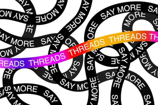
I started noticing this trend go viral ever since Instagram’s Threads app was launched. It’s a minimalist, punchy, text-first identity. Visually, it’s defined by black or white backgrounds, system-style sans-serif fonts like Helvetica or Arial, and a lowercase, punctuation-free tone that feels casual yet confident. Imagery is minimal or absent, with bold, opinionated statements taking center stage. The overall aesthetic feels like a hybrid of tech UI and the raw, expressive text-post culture of Tumblr, Twitter, and early blogging platforms.
Why are we following the trend?
The style feels straightforward and unfiltered, giving the impression of honesty and realness, which resonated with younger audiences.
It has been widely adopted and validated on social platforms, especially by creators, influencers, and brands. It performs well, so others follow suit.
It shows how typography alone can carry tone, attitude, and personality, no visuals needed.
Because it's tied to a successful product (Threads by Meta) and has cultural relevance, designers see it as a benchmark of contemporary design thinking.
Why should this trend not be everywhere?
This style, while visually striking, often ends up being used as decoration rather than design. I've seen it applied across products and services where it serves no real purpose, just a superficial attempt to make the brand feel younger, louder, or more relevant in an RGB-dominated world. When the visual treatment isn't backed by a strong message or clear intent, it becomes easy to scroll past. Without a sharp copy or a point of view, the format feels hollow, like it's trying to force meaning into something that doesn’t have any.
Just because it's trendy doesn’t mean it belongs everywhere.
This is not the end
I’ve been keeping an eye on a few more trends, and I’ll be breaking down four of them in Part 2 of this edition.
Coming your way next week!
Know someone who may be interested in part 2? Feel free to share this with them.
On another note, I am conducting a creative leadership survey to understand what teams truly need to thrive? Not just to deliver, but to grow, feel safe, and do their best work. Your perspective is essential to designing the future of creative leadership that works. This is your chance to be honest, to be heard.