

The Trend Trap: Part 2
Some design trends are everywhere right now. But should they be?

This is a continuation of Part 1 of The Trends Trap. Like I mentioned earlier, I love it when Trends inspire us, creatives, to produce great work, but the moment they start influencing how we think and act is where the challenge lies
Hence, this edition of Design in Action breaks down the most overused trends in design today and why they shouldn’t be everywhere.
#4 The Playful Type
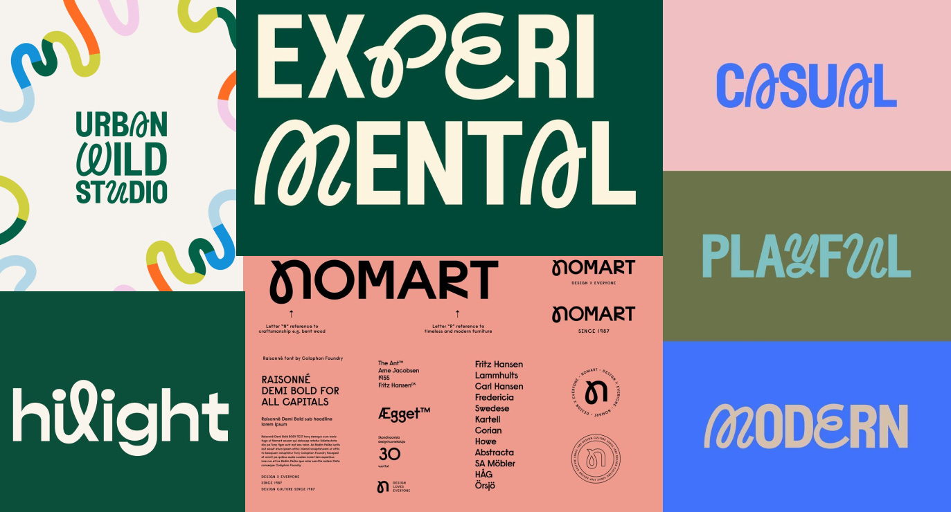
This design trend pairs a clean font with a contrasting cursive or script-like letterform, often weaving the two together within the same word. It’s typically set against high-contrast backgrounds with bold color palettes. The cursive elements are used sparingly, often replacing just one or two characters to introduce a sense of movement, flair, or personality without overwhelming the overall legibility.
The result is a hybrid type treatment that feels both structured and expressive.
Why are we following the trend?
It offers a visually interesting contrast that feels both contemporary and expressive.
The trend is fairly resilient and easy to adapt. Works well for fashion, kids’ products, event branding, and lifestyle brands.
The unexpected mix of letterforms catches attention in fast-scrolling environments.
Many designers use it to portray brands as fun and current.
Why should this trend not be everywhere?
While this style is eye-catching, it often becomes decorative rather than intentional. Many designers use it simply to inject “fun” into their identity without a concept attached to it. The overuse of this formula across unrelated categories has made it feel more like a trend-chasing shortcut, which is more likely to get approvals faster. And when the cursive element is thrown in without context, it risks becoming a gimmick. ‘Playful’ can be communicated in many ways, following this trend is not the only option.
#5 Modern, Clean Skincare Style
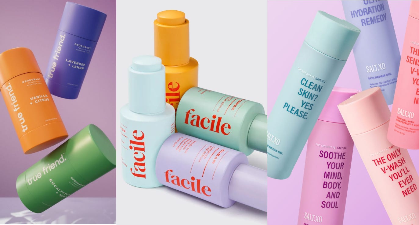
This has to be my favorite! This trend features pastel-colored packaging, often in shades of purple, pink, peach, and mint, paired with clean, modern sans-serif fonts with minimal product information laid out in a precise and structured manner. Generous use of white space or soft tonal backgrounds gives the packaging a refined, airy feel.
The result is a visual language that feels gentle, clean, and safe, conveying a sense of calm elegance and clinical clarity, suggesting that the product is both kind to the skin and thoughtfully formulated.
How it came to being? not sure, but I think Korean skincare brands popularized this clean, pastel-based design language, science-forward messaging, as seen in Innisfree, Laneige, and Dr. Jart+. Japanese minimalism contributed its signature gridded layouts and emphasis on calmness and white space, evident in brands like Muji and Shiro. Western indie skincare brands have since borrowed and adapted the look, giving it a more playful, pop-inspired spin with punchy fonts and casual taglines like “clean skin? yes please.”
I see most skincare brands in India looking like this - rooted in East Asian design principles, but reimagined with a distinctly Western brand attitude.
Why are we following the trend?
Pastels are non-threatening and signal gentleness, an easy choice for products meant to be applied to skin.
More appealing to women and social media worthy.
Unlike stark white and sterile design, pastels feel human and friendly, but still elegant and sophisticated.
It’s a game of perception. The perceived value of such packaging today is at a higher end. It makes a brand instantly feel global, modern, and trustworthy.
Why should this trend not be everywhere?
While the pastel-minimalist style is clean, calming, and visually appealing, it has become the go-to shortcut for looking “modern” and “premium” to the point where nearly every new skincare, wellness, or hygiene brand ends up looking vaguely the same.
The overuse of soft hues, centered type, and clean sans-serifs has created a sea of indistinguishable packaging. Just look at the image above. If you remove the logos, it’s hard to tell one product from another.
This might work in the context of online shopping, where users often search by brand name or recommendation. But place these products side by side on a physical shelf, and the decision-making becomes overwhelming. The cognitive load on a first-time buyer would skyrocket, and the likelihood of brand recall would drop sharply.
In contrast, heritage brands like Clinique, Kiehl’s, and L’Occitane have each built visual systems rooted in strong, distinct identities proving that minimalist or “clean” skincare doesn’t need to look identical. Differentiation is not just a branding strategy, it’s a form of communication and in categories as saturated as skincare, it’s a necessity.
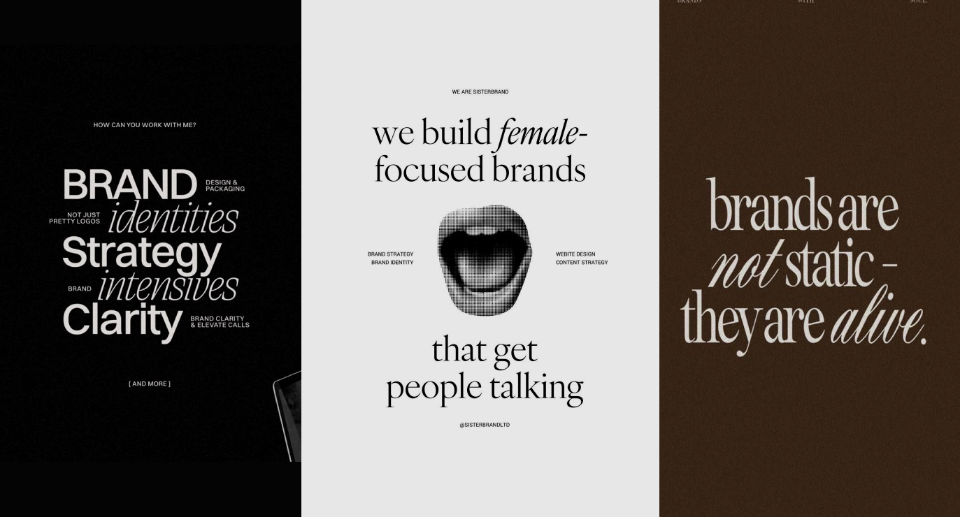
#6 The Serif and Sans Serif Love Story
I’ve been guilty of using this style too, I genuinely love how it looks. A few years back, I used it for my website and eventually outgrew it, and the aesthetic stopped aligning with what I was building.
This trend combines classic serif fonts with italicized or script-like variations to emphasize key words or phrases, creating a sense of rhythm and contrast within the layout. It typically uses monochrome or neutral palettes - black, white, beige, or muted browns and leans heavily on typography to do the visual storytelling.
Common elements include old-style or transitional serifs, italic accents for emphasis, tonal backgrounds, and the occasional use of vintage-style imagery like halftone graphics.
Supporting imagery is minimal or absent. It feels articulate, editorial, and thoughtful almost like a visual manifesto.
At its core, it’s a copy-led design style, often built around brand beliefs, philosophies, or positioning statements.
I’ve seen brand strategy consultants, coaches and creative business owners, content studios, businesses targeting high-end or thoughtful clientele use this style.
Why are we following the trend?
The serif typography evokes tradition and trust, while the italics add humanness.
With no visuals to distract, the words take center stage. It’s great for communicating value and clarity through strong messaging.
It’s relatively easy to execute, but looks intentional and elevated.
Especially for luxury service-based business, it balances warmth with authority.
Why should this trend not be everywhere?
While the aesthetic suggests thoughtfulness, strategy, and clarity, the content doesn’t always live up to that promise. It’s often used as a visual shortcut rather than a reflection of real depth (exactly why I outgrew this style, when I understood what I was building and my audience, this style didn’t fit the bill).
Its popularity on platforms like Canva has made it easy to replicate, but that ease also makes it feel templated and performative when not grounded in genuine brand intent. As a result, what once felt fresh and intentional is quickly losing its edge.
So now what?
Trends - the double-edged sword of design! They can be both blessing and curse. Over 13 years in this field, I've watched designers create greatness when inspired by trends and stumble when blindly influenced by them. I've been on both sides of this equation.
The truth is, every brand has unique needs that demand unique solutions. Our job as designers isn't to follow what's hot, but to read between the lines and uncover what makes each brand special. That uniqueness becomes our greatest opportunity to create something authentic, something true to the brand, not just impressive for our portfolios.
Speaking of authenticity, I'm planning to explore some visual styles that aren't trending right now (not as much). Will writing about them make them popular? Hard to say. I may just write about them soon.
So stay tuned for what’s landing in your inbox next week!
Know someone who may benefit by reading this? Feel free to share this with them.
On another note, if you’ve been enjoying these newsletters and they’ve helped you think differently about design, I’d love your support. I’m running a short survey to better understand creative leadership, what teams truly need to thrive, what’s working, and where to go next.
I’m about 50 responses away from making this count so if you have 10 minutes, your perspective can help shape the future of creative leadership.